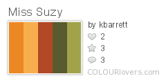
I have fond memories of this book about a little squirrel who is kicked out her tree by a group of mean red squirrels (don't you it hate when that happens?). She takes up residence in a beautiful dollhouse and befriends a nice group of toy soldiers. Artwork by Arnold Lobel.

Friday, December 28, 2007
Daily Color Inspiration: Miss Suzy
Posted by
Kara
10
comments
![]()
![]()
Labels: color, colorinspiration
Thursday, December 27, 2007
Best and Worst of 2007 (My Top Picks)

Yep. It's the end of the year. You know what that means? Lots and lots of best of and worst of lists for 2007. You can add mine to the heap. I've put together a list of the stand-out services and software I used in 2007. Some of them I loved. Some of them I despised with a fiery, I-can't-believe-it's-not-butter kind of passion. Enjoy.
I LOVE, LOVE, LOVED IT (2007's top picks)
COLOURlovers (online color tools and community)
I love this site. Did I mention the word love? Because I'm going to do just that, at the very least, about 20 more times. COLOURlovers allows its users to create custom palettes, colors, and patterns and share them. I learned about COLOURlovers earlier this year but never really used the service until recently when I needed to source a palette for a new project. I signed up for an account and I've been hooked ever since. I love creating palettes and blogging them. COLOURlovers has a nifty tool that allows me to link to a picture that inspires me and create a palette based on that image. The instant feedback from other users is great. I love the community and interaction of this site (think: flickr meets color). I also love having an archive of colors that I've used for my blog or for a project right at my fingertips when I need it. If you're a designer and you haven't spent the time to sign up for an account, then do it. Do it now. (Okay, not right now. Finish reading my blog first). This is a great service that is only going to get better. If it were a puppy, I'd buy it and take it home and feed it yummy kibble.
Tumblr (blogging platform)
This is a fun service that simplifies blogging via tumblelogs (think mini-blogs). It's a snap for novice users (or really dumb people) to sign up and start posting content online. I love their layouts, the customization options, and the fact that you can post music. Are there things I would change? Yes. But overall, I have had a great experience with my own tumblelog. I'm excited to see the direction this company takes in 2008.
Flickrriver (photo tool)
This little service does one simple thing and it does it well (letting you view flickr content). Maybe that is the key to success with good companies and services - Keep it simple. Flickrriver lets me grab photos or a photo set from a flickr account (via a username) and create a simple widget (or a cool, infinite scroll-y widget) to embed in my website or blog. I recently showcased Eric Natzke's work on my blog via a flickrriver widget. Check it out.
FontDoc (font software)
A freeware program that lets you preview text (that you type) with the fonts installed on your machine. Nifty when you are quickly trying to select a typeface for a logotype or tagline.
LOOP for Firefox (extension to upload, covert and combine your files to PDF)
You can assemble pdfs in a breeze with this tool. It came in handy for me a couple of times this year when I needed to combine multiple single pdf files together in one file but didn't have the Adobe software to do it.
Blogger (blogging platform)
I have been mostly pleased with the big upgrade that Blogger launched this past year. In some ways it's much easier for me to adjust the look and feel of my blog template. The auto saving when composing a draft is terrific and the platform seems really stable. I haven't experienced much, if any, down time. There are a few things that still need improving. For instance, I absolutely cringe at the way Blogger handles the photos that are uploaded through their interface. The image degradation is terrible. I've discovered that the best solution is to link directly to my flickr images. I would also really, really like it if Blogger made it possible for me to upload music files (like those cool kids at Tumblr). But all in all, Blogger provides me with a nice, customizable blogging solution. And it's free. So I can't complain (although some nifty new layouts would be the definition of sweet).
I DIDN'T LOVE IT (2007's not-so-top picks)
ClassicFTP (ftp software for the mac)
Oh. My. God. This ftp client freezes up every single time I double click a folder. Terrible.
DropSend (online storage...allegedly)
I signed up for a paid account on DropSend even though they were a bit more expensive than other online storage solutions I found. But I didn't mind. I liked the design of their site, the simple interface, and their nifty uploader software. I had a big warm fuzzy for this service. Well, that changed. I missed ONE billing cycle because I lost my debit card. A new one was issued but I didn't get the new card info posted before they tried to bill me for that month. So basically, I forgot to update my account with the new card information (these things happen, right?). When I realized that I needed to update the information I tried to log into my account to update it. Guess what? My account didn't exist and DropSend DELETED everything. My account contained photos and other items that I did not have backed up anywhere else (because I thought they were safe). I lost all of my files. When I contacted the company they were incredibly slow to respond, unsympathetic, and eventually put me in touch with some programmer who told me my stuff was gone and he couldn't get it back. Unbelievable. Seriously, my card could only have been rejected one time. It wasn't like my account had lapsed for months. To make matters worse I never received an email (yes, I've heard Zoto users claim this kind of thing, too). But in my case, it's the truth. I was surprised because at Zoto we keep people's photos around a LONG time (like FOREVER). Dropsend? DELETES your crap ASAP. I didn't have a backup of my dropsend backup which means that every single dime I spent on this service was wasted. I might as well have driven around and thrown money out of my car window. How can I best describe how I feel about this service? Let me put it to you like this. If Dropsend was a run by a group of sweet little old ladies, I wouldn't care, I'd still kick them in the shins (hard) and tell them they suck.
ConceptShare (online design collaboration)
Concept share allows designers to post their design comps online for review and collaboration (perfect for teams who work remotely). The concept is great. But our team tried it and I really wasn't that impressed with V1 of the site. To be fair they've released a V2 of the site I haven't checked out yet. Don't get me wrong. It's not a bad service but I definitely didn't love it and I was not impressed enough with it to keep shelling out $20 bucks a month for it. I did like aspects of the product like the ability to circle and make notes on the comps (for me this was the most useful part of the application). But even that functionality was a bit awkward and fell short of my expectations. I do a lot of interface design work. It can be a bit overwhelming to manage because there are tons of design comps. Even something simple, like a sign up form, can have dozens of comps associated with it, all depicting the different scenarios of user interaction. Those designs have to be reviewed, discussed, modified, resubmitted, and the final (approved designs) have to be uploaded to a place where the programming team can reference the final comps along with notes about functionality. In fact I would estimate that the Zoto 3.0 redesign had virtually hundreds of comps designed for it by the time it was complete. It stands to reason that any project with Zoto's kind of scope and magnitude is going to require a pretty awesome tool. But Conceptshare isn't that tool. Although it would probably be a useful tool for small (baby) projects, it falls short in meeting the needs of large (big boy) project work. As a UI designer I need to batch upload dozens of comps easily and quickly, mark on them, tag them, make notes, and then send them to everyone on the team. I also need a really good way to keep everything organized. I wasn't able to do this easily on Conceptshare. In the end, I went back to the solution we used for developing Zoto - a dedicated wiki. This service does have a lot of potential and I'll definitely keep my eye on it. If they made some enhancements to the UI (a nifty batch organizer like Zoto?) and combined it with an invoicing utility it would be the most rockin' freelancing tool ever.
Digg (popular social news site)
I used to love this site. That's right. You spell that L-O-V-E with a capital L. But not so much lately. The bottom line is that unless you take the time to cultivate a group of friends who are willing to reciprocate diggs (votes), your stories are NEVER going to make it to the front page. That is a fact. As a reader I am also disgusted by the sheer volume of (how can I put this politely?) crap that makes it to the front page. And the most important section of the site (to me at least), the design section, is anorexic of any genuine design-related content (hey kids, CSS is not design - fyi). I still visit the site and try to submit articles from my blog because the site is immensely popular and someday I'd like to have more than 5 regular readers. But when Digg changed its format and opened up the floodgates to mainstream users it killed a really good thing. Sorry, Mr. Rose. But your news site suck balls. Nuff said.
Twitter (post stuff you're doing)
I tried. In earnest. Really. But I still don't get it. I know I'm supposed to like it because everyone else likes it and thinks it's très genius. I do think that the site is pretty (just my 2¢ cents) and I will admit that the popularity of this service has made it fun to find people and "follow" their Twitter posts (daily snippets). I've particularly enjoyed reading about the trials and tribulations of the WGA and I would love, love, love to follow Joss Whedon on Twitter (if he had an account). So KUDOS to Twitter for legitimizing the voyeuristic, stalker-y tendencies of some internet users and simultaneously capitalizing on the narcissistic natures of others. But at the end of the day, it's just people blogging sentences. Plain and simple. What is even worse, is that most of the time it's stuff like, "I had coffee at Starbucks. The hippie girl at the counter had a nose ring". Um, okay. See what I mean?
Notes:
I mentioned Zoto quite a bit in this post. In case you are wondering, Zoto is an online photo hosting and sharing application. I've spent the past 2 years working on their interface and redesigning it. The new design launched in March of 2007.
Posted by
Kara
1 comments
![]()
![]()
Labels: dropsend sucks, links
Wednesday, December 26, 2007
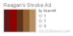
Daily Color Inspiration: Vintage Ronald Reagan Ad
I took break from my blog during the holidays but I'm back now and serving up a new palette. Enjoy this vintage ad featuring a young Ronald Reagan pimping cigarettes for Christmas. Ho, ho, ho...holy cow, Mr. President.
Check out the festive Christmas-card cartons. You don't see those anymore, do you?
Posted by
Kara
9
comments
![]()
![]()
Labels: color, colorinspiration, design, vintage
Friday, December 21, 2007
Tasty Design Nibblets
Oh, yes. These are the num-num-nummiest design links you will find all day.
Rock Band Logos
Ali Edwards Art Journals
The beautiful layouts of this scrapbooking maven are beyond words.
Design*Sponge
Design*Sponge is a daily website dedicated to home and product design run by Brooklyn-based writer, Grace Bonney. A great resources and I love the the scrappy shabby-chic design.
Scrapbooks = Genius
"All the best creative people I've ever worked with have kept scrapbooks. They're always snappers-up of ideas and the physicality of a scrapbook ads something to the process."
Russell Davies wrote this great entry way back in 2006. I just stumbled across it again in my old bookmarks. Great little read for creative types.
WEAR palettes
Love, love, love the concept of blogging color (as you can see from the daily color inspiration posts that I recently introduced as a regular part of my blog). Most of my inspiration comes from vintage albums, posters, and misc artwork. Wear Palettes is a creative little blog that takes its inspiration from fashion. Like me, they also post palettes from COLOURlovers. Enjoy perusing this fantastic color palette blog based on fashion photos from the satorialist.
Posted by
Kara
3
comments
![]()
![]()
Labels: color, design, inspiration, links
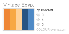
Daily Color Inspiration: Vintage Egypt Travel Poster
Posted by
Kara
3
comments
![]()
![]()
Labels: color, colorinspiration
The Blog Is Blue
Okay, I changed my mind again. Now the blog is blue (like a big sky filled with design-y goodness). Enjoy. The pink was just too much. So let's try this for awhile. Who knows. Perhaps I'll go back to a traditional white background in a few weeks. But white is sooo boring. I really like keeping it colorful.
Like my colors?
Posted by
Kara
2
comments
![]()
![]()
Labels: colorinspiration, colorspretty
Thursday, December 20, 2007
The Blog Is Pink.
So I got a bit tired of the green and decided to mix it up a bit. I'll probably be changing it again in a few weeks. I don't see any reason why my blog design and color scheme should be set in stone. Design should be versatile. It's one of the reasons I keep it (the blog) intentionally simple. I like switching out logotypes and colors when the mood strikes me. Besides, I doubt the five people from the Ukraine who read my blog will mind.
;)
Posted by
Kara
0
comments
![]()
![]()
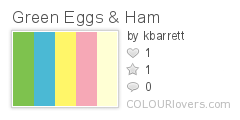
Daily Color Inspiration: Dr. Suess
Green Eggs and Ham by Dr. Seuss was the first book I ever read. Don't ask me how I remember that. I don't know. Honestly, there are parts I can still recite by heart. Who could forget the distinctive illustrations of their beloved Dr. Seuss books? I dare you not to be inspired by his colorful palette.
Would You? Could You? In a Car?
Posted by
Kara
2
comments
![]()
![]()
Labels: color, colorinspiration, dr.seuss
Wednesday, December 19, 2007
Case Study: The Evolution Of A Homepage Design
As a designer I know that I enjoy reading about the process of other designers and the stories behind their design projects which is why I thought I'd take this opportunity to share my own design story on a recent project. I've spent the past couple of weeks designing for a new photo hosting site that Zoto is developing. It's an offshoot site called fotofluff that's set to launch in January. What follows is the story of the fotofluff homepage design and its evolution from initial concept to its final design iteration as a static HTML page. Although not every project is exactly the same I hope it provides a little insight into my design process, and the project itself, for anyone who's interested.
Why is the homepage so important? It establishes the look and feel of the site, communicates the brand, and directs the user to action.
The Initial design
Challenges:
1. Create a simple form on the homepage that could serve two functions. The user could either:
a) upload a photo for hosting or
b) create a fluff of photos (multi-user pool of photos)
2. No existing logo or design collateral. No copy or content. I had to write the copy, organize the content, create a logotype and drive the creative direction.
Client's Design Requirements:
Make it look as 2.0 as possible.
Communication/Design Goals:
Keep it fun and simple. Communicate what fluffs are to new users.
Creative Direction:
With this particular project I knew I wanted to do something dark and rich with the overall "look and feel". I sourced color palettes for inspiration and knew right away that I wanted the site to be brown. I had good sense of the kinds of elements I needed in this design for it to meet my client's requirements. Illustrated artwork and the diagonal lines were elements I incorporated to give the design a 2.0 aesthetic. After I had my palette in place I opened Photoshop and started creating my initial canvas. A day or so later, after adding and refining the visual elements and polishing up my comp a bit, I had a homepage design to present to my client in a meeting.
Second Pass (per post meeting notes)
After review and discussion the process of design revisions began.
Client Changes:
1. Get rid of fluff character and replace with a sheep character.
2. Modify the form (per the client's specific directions).
3. Add text explaining that unviewed fluffs will be "swept up" after 30 days.
4. Add option for users to link to photo or video (explored as a future option).
5. Remove top links to photos and fluffs (no system searching to be implemented for these items).
My Changes:
1. I balanced out the top bar and bottom bar elements on the page.
2. I centered up and tightened the content.
3. I brightened up and simplified the design by softening the bubble element. I modified its color and the form field color to a warmer shade of brown.
4. I lost the brown buttons completely and made my form buttons the same uniform, bright green.
Third Pass
Client Changes:
1. Remove divider in the form.
2. Remove the Already have a fluff? text.
3. Remove option to link to photo and video.
4. Add the word optional next to the name your fluff field.
Fourth Pass (further simplifying the form)
My Changes:
I shortened the form by making the enter mgmt code option an on demand element that would only appear after the link was clicked (a good usability decision).
Fifth Pass (Refined homepage. Overall simplification of elements.)
I have a bad (or possibly good) habit of constantly revising my designs. For me, design is a lot like writing something. I compose a rough draft and keep revising until either I'm satisfied (which is rarely the case) or it's deadline time. Usually the latter.
After working on the design for the interior pages I revisited the homepage design again (with a fresh set of eyes). I didn't feel satisfied with it. I wanted the logotype to be simpler and I wanted to remove the 2.0 treatment. I kept the same typeface (a rounded type that would still be reminiscent of the 2.0 "look and feel"). I also felt that overall the page was still too busy (too many colors, elements, and typefaces competing with each other). I wanted to do a better job of keeping the user's eyes focused on the important elements. My goal was to distill the design to its most important visual elements.
Changes & Notes To Myself:
1. Remove 2.0 treatment from logotype and add more breathing room between the characters. Change the color to something light.
2. Center up the logo with tagline on the page. Keep it direct and focused.
3. Increase font size for the form and increase length of form field (helps to create a better visual balance between the elements).
4. Darken the 'swept up' text so it attracts less visual attention.
5. Modify the text bubble by:
a) incorporating a cloud shape with rounded curves to offset the hard lines of the composition.
b) using color to bring visual attention to the text and brighten the overall design.
6. Remove photo elements.
Details: By this point I knew the site would eventually support video and possibly music so I wanted less 'photo' focus. I also felt the photo elements were too visually distracting. They just didn't work in the composition (even though I liked them). Removing them made the composition much cleaner and focused.
7. Increase font size for the form field description and button text and increase length of form field to create a better visual balance between page elements.
8. Reduce overall color elements to bring more visual attention to the upload button (which should be the focus of the page - it's our call to action).
9. Modify the sheep to keep a sense of the multiplicity that should be associated with fluffs (which was lost when the photo elements were removed).
10. Integrate the 'no sign-ups' and 'no hassles' text into the bubble text to remove unnecessary text elements on the page.
11. Change bubble type to standard Trebuchet used for the forms and default text for visual consistency and to bring visual emphasis to the tagline.
Final Design Iteration
After the final design was approved I began construction on a static version of the page that could be handed off to the developer. I tweaked the fonts and form elements slightly in the HTML version, but overall, it retains the look and feel of the final comp.
You can view the static HTML here: http://www.colorspretty.com/fluff/home/
Look for the fotofluff.com site to launch in January. I'll be posting when we are ready launch the site.
Please feel free to share your case studies and design stories (just leave your links in the comments). I'm always interested in learning about the process of other designers.
Posted by
Kara
5
comments
![]()
![]()
Labels: design, homepage design, process
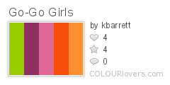
Daily Color Inspiration: Vintage Album Cover Art
I dig the bright, imperfect, hand drawn and collage-y style of this cover art. It's creative and bold. That big, phallic spaceship (or missile?) beneath Jane Fonda is beyond words.
Posted by
Kara
5
comments
![]()
![]()
Labels: color, colorinspiration, design, inspiration
Tuesday, December 18, 2007
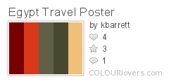
Daily Color Inspiration: "Egypt For Your Holiday" Vintage Poster
Posted by
Kara
4
comments
![]()
![]()
Labels: color, colorinspiration, design, vintage
Monday, December 17, 2007
Daily Color Inspiration: Eric Natzke's "Pnk"
I'm a sucker for pink and this vibrant composition is all kinds of pink-ooh-la-la-delicious-goodness.
Eric Natzke's "Pnk"

Featuring two of my new color creations:
Posted by
Kara
0
comments
![]()
![]()
Labels: color, colorinspiration, natzke, pink
Saturday, December 15, 2007
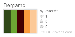
Daily Color Inspiration: Bergamo Vintage Travel Poster
Posted by
Kara
4
comments
![]()
![]()
Labels: color, colorinspiration, design, inspiration, vintage
Featured Inspiration: The Color Green
“If I keep a green bough in my heart, then the singing bird will come” - Chinese Proverb
My blog is green. You may have noticed. That's because green is my favorite color and I'm here to sing its praises. Green connotes life, fertility, renewal, nature, and hope. It has positive cultural associations across the globe. Green is second only to blue, which is the most popular color worldwide.
Green is is part of our collective consciousness regardless of country or culture. We have powerful emotional associations with it. Green is blades of grass underneath our bare feet. It's the flicker of leaves against a blue sky on a summer day. It would be nearly impossible to not associate green with good things.
Given the emotional power of green, it's easy to see why designers are eager to use it in their designs. Color has a powerful impact on people. Using the wrong color in a design can potentially alienate your audience or create a counterintuitive association with your brand. Using the right color can cement the desired association with your brand and help you succeed.
Green In Identity Design
Kudos to the following companies for being smart enough to take advantage of the positive influence of the color green in their branding.
Green In Web Design
These sharp looking sites have clued in to the beauty of the color green.
http://www.riscoaolado.com
http://www.danviv.net
http://www.freerice.com
http://www.moourl.com
http://mobygreen.com
http://www.wilsonminer.com
Fun Facts About The Color Green
- Green is the most restful color for the human eye.
- Researchers have also found that green can improve reading ability.
- Suicides dropped 34% when London's Blackfriar Bridge was painted green.
- Green has long been a symbol of fertility and was once the preferred color choice for wedding gowns in the 15th-century.
- Green is used worldwide to represent safety.
- Those who have a green work environment experience fewer stomachaches.
- Green occupies more space in the spectrum visible to the human eye than most colors.
Green, Green, And More Green
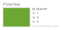
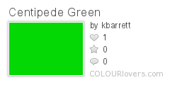
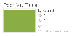
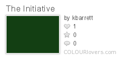
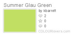
Feeling inspired yet? Embrace your inner love for the color green. Enjoy these varied and beautiful greens I created at COLOURlovers. Maybe they will help jumpstart your next creative endeavor. Enjoy.
Music:
The Color Green (Band) - http://www.thecolorgreen.tv
Sources:
Sensational Color - All About The Color Green
About.com - Color Psychology Green
Color Matters - The Evolution Of The Symbolism Of Green In Western Culture
Posted by
Kara
9
comments
![]()
![]()
Labels: color, green, inspiration


